Project Overview
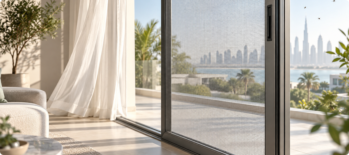
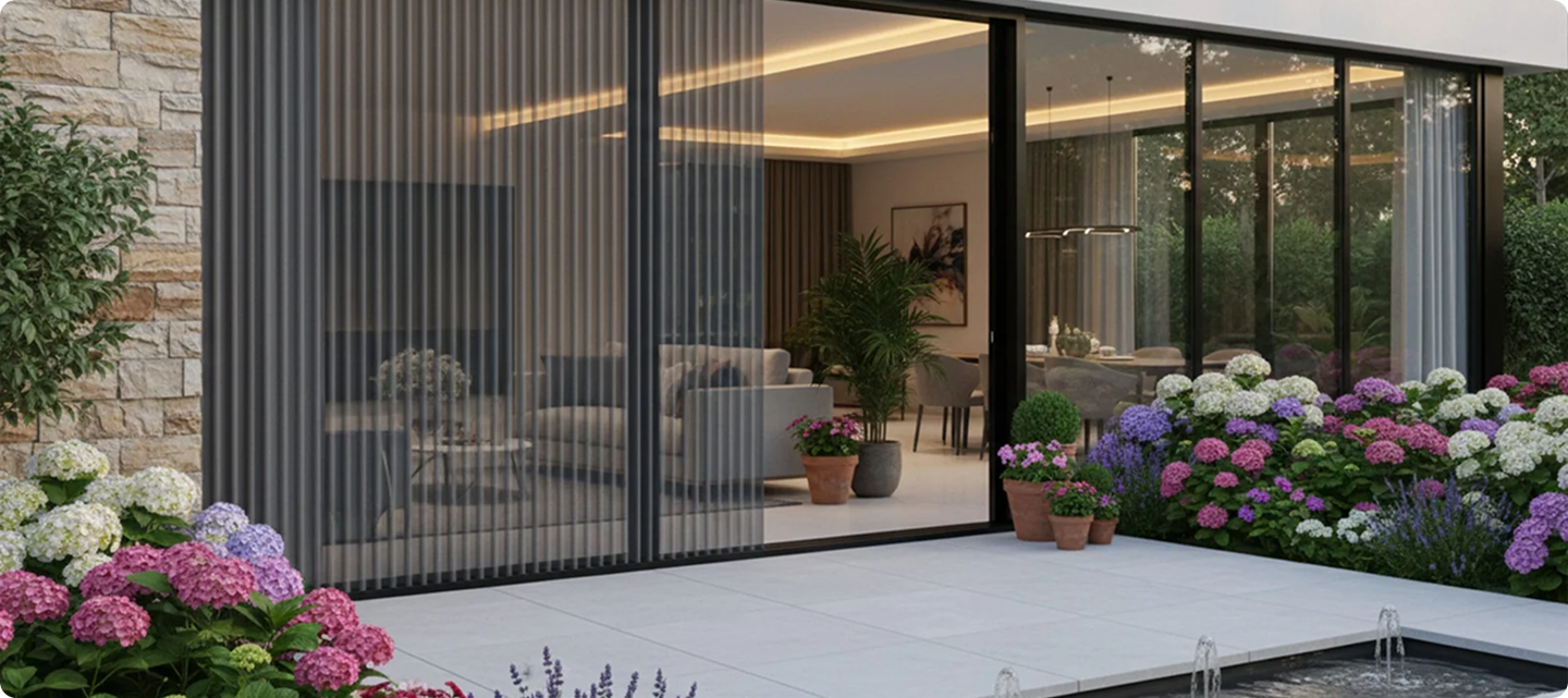
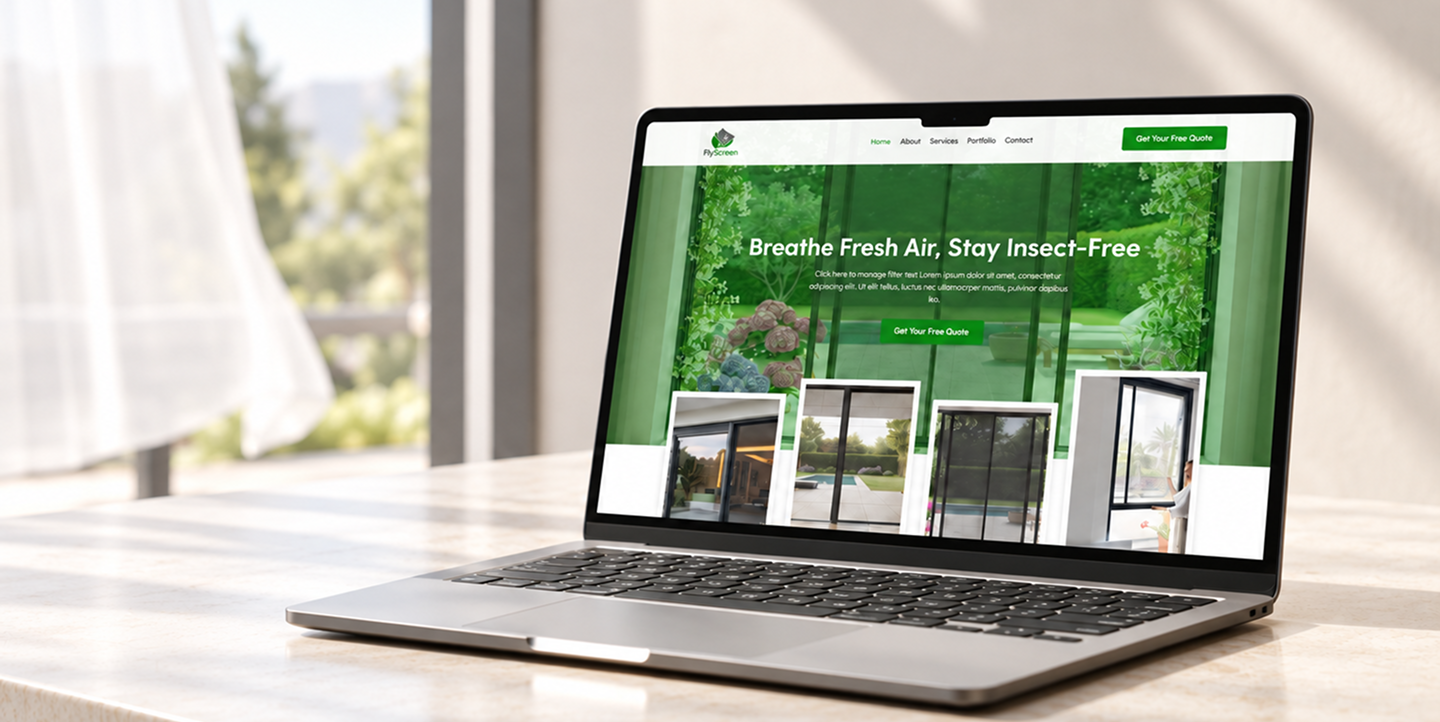
FlyScreen is a digital platform dedicated to presenting insect screens and window protection systems for homes and commercial spaces. The platform showcases a curated range of screen types alongside expert guidance for measuring, selecting, and installing the right solution. The goal of the project was to build a clear, professional, and trustworthy digital presence that simplifies how users explore products and request a quote. Technical X Digital Agency delivered the UI/UX design and full visual identity, including the logo design, ensuring a cohesive and credible brand experience.
The challenge
Selling made-to-measure protection products online comes with a specific set of challenges :
- Presenting a range of screen types and frame options in a simple, accessible way
- Building instant trust and credibility for products fitted onto the home
- Helping users quickly understand which screen system fits their windows and doors
- Creating a structure that can scale into a future quotation and booking platform
The Solution
We designed and built the FlyScreen website on Next.js and created its full brand identity, presenting insect screens and window protection systems with guidance for measuring, selecting, and installing the right solution.
Key Features
- Clear categories for screen types and frame options
- Guidance for measuring, selecting, and installing
- Quote request and contact flow
- Complete visual identity, including the logo and market colors
- Responsive design across all devices
- Structure ready for online quotation and booking
UX Strategy & User Journey
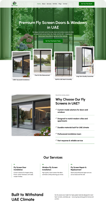
The user experience was built around clarity and direct action.
Entry & First Impression
The homepage immediately communicates the core offerings, supported by strong product-focused messaging and a professional visual tone.
Browsing & Product Discovery
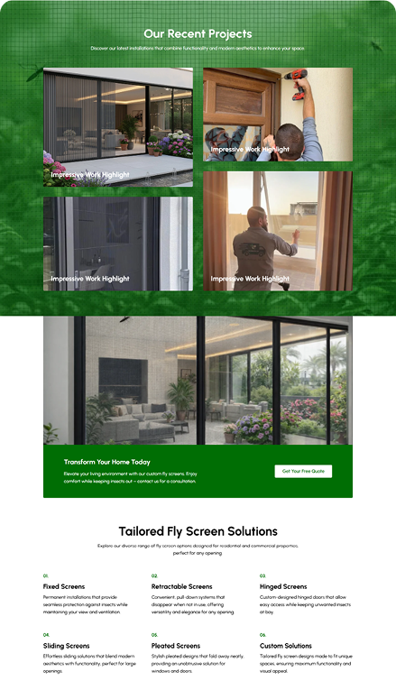
Content is structured into clear categories, allowing users to quickly identify the screen system they need without technical overload.
Understanding Value
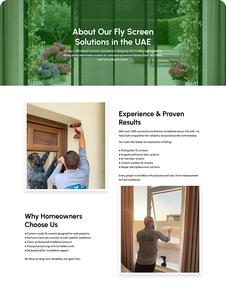
Each product section highlights benefits such as build quality, mesh durability, and long-term reliability, helping users feel confident in their choice.
Contact & Conversion
Clear calls-to-action guide users toward requesting quotes or contacting the team, reducing friction and encouraging quick engagement.
Focus: Simplicity, trust, and ease of action.
LOGO ELEMENTS

A simple mark built from roof, window, plant, and screen elements.
FINAL MARK
A clean, readable logo system designed for digital and service use.
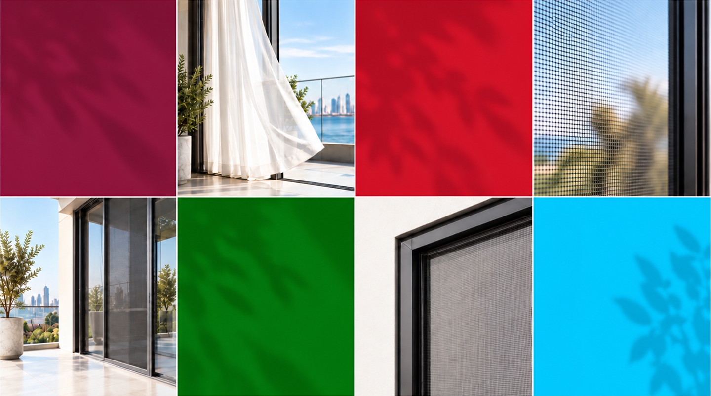
MARKET COLORS
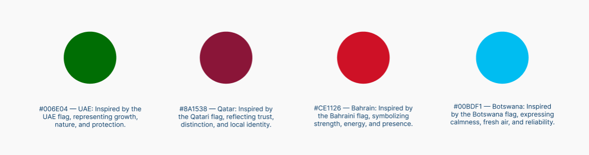
Market color variants keep the brand flexible while preserving the same identity.
COLOR VARIATIONS

The system supports multiple uses without changing the core logo structure.
Brand Identity & Logo Design
Technical X Digital Agency developed a modern and professional visual identity that reflects the brand’s core values: reliability, quality, and technical expertise.
The logo was designed with a clean and structured form, ensuring it feels both approachable and technically strong. The identity system supports consistency across digital platforms, product materials, and future physical branding.
UI Design System
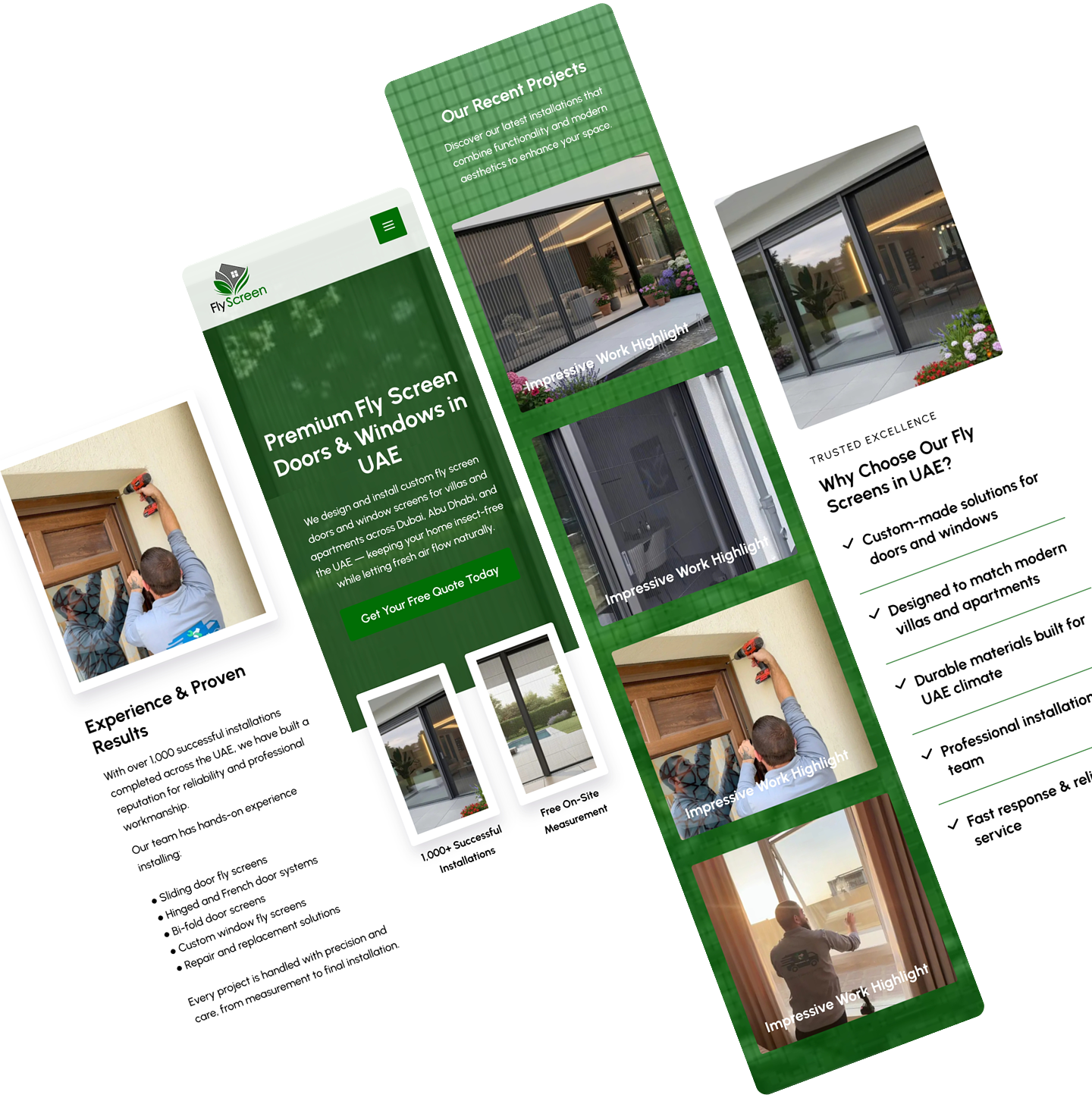
The interface design emphasizes clarity and professionalism:
- Clean layouts with clear content separation
- A structured visual hierarchy that guides user attention
- Professional typography focused on readability
- Balanced use of brand colors to communicate trust and technical reliability
Accessibility & Responsiveness
- Fully responsive layouts for mobile, tablet, and desktop
- Touch-friendly navigation and spacing
- Clear typography and strong contrast
- Logical structure for intuitive browsing
Frontend Experience
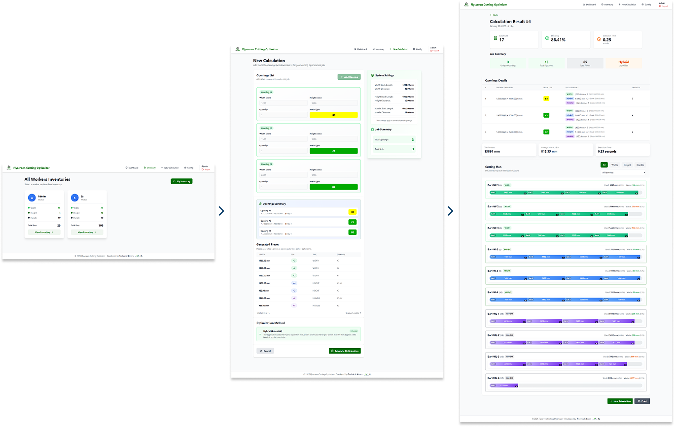
The frontend was structured to provide:
- Smooth and fast navigation
- Clear presentation of products and services
- A scalable layout ready for future feature expansion
- Consistent application of the visual identity across all sections